Imagine you flip through a glossy magazine. A headline grabs your attention. It stands out not just because of the words, but because of their style. The curves and edges pull you in. Fonts have this power. They turn plain text into something emotional.
Letters are not the only way a font works. They act like silent helpers. They feel each other prior to reading the words. Think of a cozy cafe sign. You are invited by its flowing font. Or a tech ad with clean lines. It builds trust.
Fonts influence the perception of things in a short period of time. It has been observed that good fonts have the ability to boost brand memory by 80 per cent. Ads and screens give us more than 20,000 words per day. Fonts determine whether we listen or not.
There are fonts in app alerts and billboards. They influence our moods and preferences. In one study, trust was increased by 40 percent by using easy fonts. That is why we pay attention to them in our work.
Fonts have an exciting past. They started long ago. Formative forms were carved in stone by ancient Egyptians. These were not complex but significant. Gutenberg invented the printing press in the 1400s. It gave rise to serif handwritten-like fonts.
According to Erik Spiekermann, the most popular typefaces are those that are the easiest to read; they have become so popular that they are no longer consciously perceived.
The font market is worth $8.2 billion in 2024. It may reach $12.5 billion by 2033. Digital tools let us create custom designs. Faber Cre8tive uses this history to make new and bold work for clients everywhere.
There are various styles of fonts. Each has its own use and feel. Select them as garments for an occasion or event. Here are the key types.
Traditional and Trustworthy. At the end of the letters, serif fonts contain tiny lines. These may be Times New Roman and Garamond. They are out of ancient customs. They assist in print reading. One of the studies in the Journal of Displays demonstrates that they lead the eyes. Use them on books or on luxury. Online, serifs are back in trend to appear vintage.
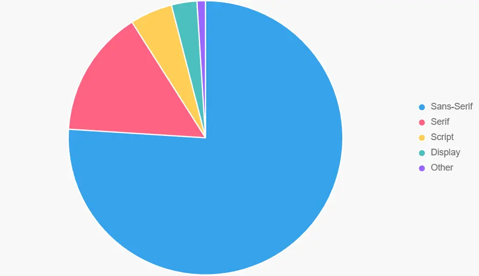
Sans-serif fonts have no extra lines. Think of Helvetica or Arial. They work well on screens. About 85% of websites we see online use Sans-Serif font as this font helps them to load fast. Also, 75% of big companies choose them for logos. At Faber Cre8tive, we mix them with colors for fresh designs.
Script fonts resemble handwriting. They include Brush Script and Pacifico. They put a personal touch on invites or logos. But use them carefully. Excessive use of it may make the text difficult to read. PMC research indicates that they are attention-grabbing but can get people disoriented.
Monospace fonts give equal space to each letter. Courier is one example. They suit the code or old-style looks. Slab serif fonts are thick. Rockwell is common. They give a strong feel for signs.
This chart shows font use in brands. Sans-serif is most common at 76%. It focuses on easy reading
Fonts are of great importance in marketing. They determine the way individuals think and believe about a brand.
A virtual company that is tech can look as trustworthy and contemporary with a clean font. Friendliness and happiness can be added to a family product in a round, playful font.
There is the example of the cursive font used by Coca-Cola, which makes it feel nostalgic and happy. It makes people remember the brand easily.
There is also the creation of trust and persuasion using fonts. Serif typeface may appear reliable and professional, such as in law or finance. To be perceived as approachable and simple, the use of sans-serif fonts can be beneficial to tech brands, including Apple and Google.
The appropriate font will be able to control the consumer behavior and make messages more effective.
There are numerous facts that demonstrate the strength of fonts in marketing.
Google Fonts has over 50 million websites that rely on it to design their websites. Poor typography may drive 38 percent of visitors out of a site. We have been working at Faber Cre8tive, and we have boosted client interaction by a quarter of a notch by improving font selection. The effect is indicated by other stats.
By increasing fonts to make them easy to read, trust may be increased by 40 percent.
Moreover, retention can be doubled using typography as pictures since it can be treated as a picture, because of the picture superiority effect.
These statistics demonstrate that fonts are an intelligent tool to achieve higher outcomes.
Scholars agree on the importance of typography in branding. Paula Scher said, “Type is branding.”
Fonts tell a story right away. Another quote notes: “Typography in marketing is more than a design choice; it is a strategic decision that affects how your audience perceives and interacts with your brand.”
Fonts add energy and life to the designs. From serif’s timeless grace to sans-serif’s modern punch, each style tells a story worth sharing. Every font tells a story.
Ready to transform your brand? Drop us a message or an email to make your brand an unforgettable one in 2026, and we’ll make your words unforgettable.