There is a reason some websites feel expensive before you even know what the company sells.
Surfing the internet, you land on a homepage where there is space to breathe. The typography is confident. Every image has a purpose. There are no flashing banners fighting for attention or endless paragraphs begging to be read. Somehow, without saying much at all, the brand has already earned your trust.
That is design.
Good design is no longer about being pretty. It affects thinking, emotion and decision-making. A well-designed website has a significant impact on whether your business is worthy of their time and whether it is credible and helps with conversions.
Interestingly, many of the world’s most successful brands are moving in the opposite direction of what many businesses expect. Instead of adding more features, colours, animations, and content, they are removing them.
Minimalism has become the new mark of confidence.
At Faber Cre8tive, we believe great marketing starts long before the first headline is read. It begins with the experience your audience has within the first few seconds.
Why Design Has Become a Marketing Strategy
For years, design was treated as the final layer of a marketing campaign. Today, it sits at the centre of the customer experience.
According to the Stanford Web Credibility Research, approximately 75% of users judge a company’s credibility based on its website design. When visitors encounter an outdated, cluttered, or confusing website, trust drops almost instantly, regardless of how good the product or service may be.
Similarly, research published by Google found that users form an opinion about a website’s visual appeal in as little as 50 milliseconds.
That means before someone reads your value proposition, compares your pricing, or contacts your sales team, they have already made an emotional judgement.
Design is marketing.
Why High-End Brands Are Choosing Less
Luxury brands have mastered one important principle: They never compete for attention. Rather, they command it.
Instead of overwhelming visitors with information, brands such as Apple, Rolex, and Aesop create digital experiences that feel calm, intentional, and premium. Every visual element has a purpose.
Minimalism communicates confidence because it says: We know exactly who we are, and we do not need to prove it with noise.
This philosophy is now spreading well beyond luxury brands into industries like professional services, healthcare, finance, technology, and even manufacturing.
The Psychology Behind Minimalist Design
Minimalism is not about removing everything. It is about removing everything that does not matter.
1. Your brain loves simplicity
Comparatively, the human brain processes visuals faster than text. When information is organized clearly, users understand it more quickly and make decisions with less mental effort.
Researchers have consistently shown that users prefer interfaces that reduce cognitive load and make important information easier to find.
A cleaner website creates:
2. More is confusing
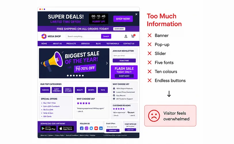
Too much information makes the visitors feel overwhelmed. With a minimalist experience, visitors are confident in their desired actions.
3. White Space Is Not Empty Space
One of the biggest mistake in website design is considering empty space to be a wasted opportunity. It is not.
White space directs attention. It creates hierarchy, improves readability, and allows important messages to stand out.
Think of it like a gallery. A masterpiece placed on a crowded wall loses its impact. The same artwork displayed with room around it instantly becomes the focal point.
The exact same principle applies to websites.
4. The Hidden Cost of Visual Clutter
Many businesses believe adding more information creates more value. The opposite is often true.
When visitors see too many choices, too many offers, or too many competing messages, decision-making slows down.
Psychologist Barry Schwartz described this phenomenon as the Paradox of Choice, where excessive options can actually reduce customer satisfaction and conversions.
If your homepage tries to sell everything, it often sells nothing.
What Makes a Website Feel Premium?
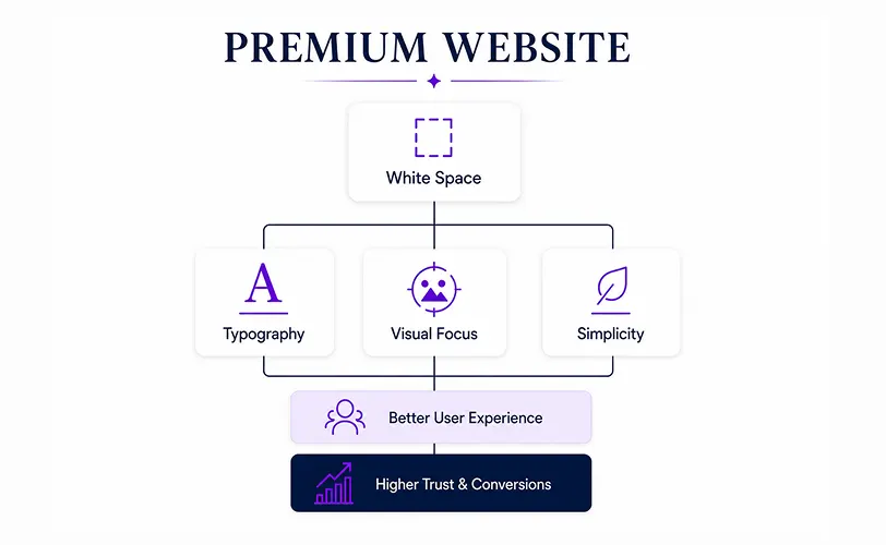
It is rarely expensive animations or complicated layouts. Premium websites usually share the same design characteristics.
1. Consistency
Colours, typography, imagery, and spacing work together to create one clear identity.
2. Intentional Photography
Every image is used to reinforce the text and does not just fill up the space.
3. Clear Navigation
Visitors never have to wonder where to click next.
4. Strong Typography
Strong and aesthetically pleasing typography creates personality without overwhelming the reader.
5. Purposeful Colour
Rather than using every colour available, minimalist websites rely on a carefully selected palette that reinforces the brand.
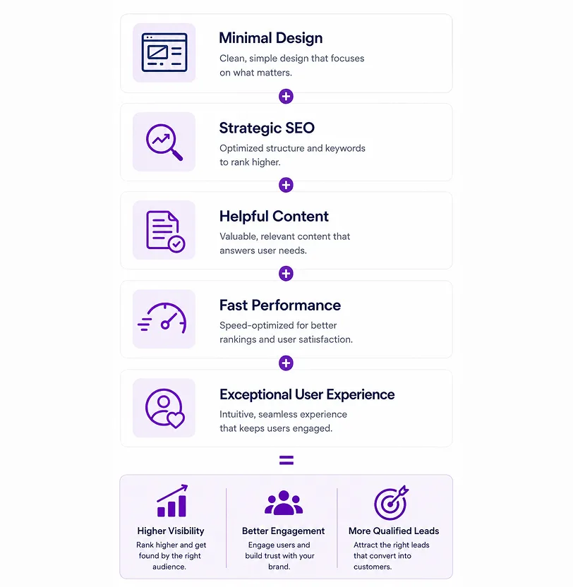
The Anatomy of Premium Design
Minimalism Is Good for SEO Too
Minimalist websites often face one common criticism.
“If there’s less content, won’t SEO suffer?”
Not if the website is built strategically.
Minimalism should reduce clutter, not information. The goal is to deliver the right content in the right place while making every word work harder. Minimalist design is not just attractive. It also supports better website performance.
Google takes into account things like site speed, mobile-friendliness, and user experience when determining site rankings. Cleaner websites tend to have less crap code, less clutter, and more focused content, which can improve their load times and engagement metrics.
According to Google’s Core Web Vitals guidance, faster websites create better user experiences and are more likely to retain visitors.
Good design and good SEO are no longer separate conversations. They work together.
Let Your Blog Do the Heavy Lifting
One mistake many businesses make is trying to fit every keyword onto their homepage.
Instead, keep your website clean and let your blog build topical authority.
For example, a web design agency can keep its homepage focused on user experience while publishing articles around topics such as:
This approach allows the homepage to be kept elegant, and the website’s search engine presence is boosted continually.
According to HubSpot’s State of Marketing, companies that create helpful blog content have been known to have a lot more indexed pages and organic traffic than firms that only have static website material.
Minimal Does Not Mean Boring
One common misconception is that minimalist websites all look the same. The reality is quite different.
Minimalism creates room for stronger branding. When unnecessary elements disappear, what remains becomes more memorable.
That could be:
Minimalism is not about removing personality, but about giving personality room to breathe.
Is Minimalist Design Right for Every Business?
Not every business needs an all-white website with tiny black text.
Minimalism should always support the brand strategy, not replace it. The goal is clarity.
Your website should answer three questions right away, regardless of what type of business you’re in:
Everything else should support those answers.
Design That Sells Without Feeling Like It Is Selling
The best and most effective kind of marketing rarely shouts. It guides, earns attention and leads instead of asking for it.
The effective marketing builds trust before asking for a sale. That is exactly what thoughtful design does.
Minimalist websites are not successful because they are trendy. They succeed because they remove distractions, improve user experience, and allow great brands to communicate with confidence.
As digital competition continues to grow, businesses that simplify their message will often stand out more than those trying to say everything at once.
The Courage to Be Simple
It takes a surprising amount of confidence to be simple. It is incredibly easy to hide a mediocre product behind a wall of flashy features, auto-playing videos, and dense paragraphs. It takes true brand authority to strip all of that away and say, “Our work speaks for itself.”
You do not need to shout to be heard. Indeed, in a digital world overrun by noise and endless scrolling, the brands that are sure of their whisper are the ones that truly get heard.
At Faber Cre8tive, our focus is on more than just making designs beautiful. We believe that there is no set approach for marketing. Rather, marketing depends upon the requirements of the niche you are working on. Marketing is effective if designs are functional. We build trust, enhance your brand, improve search ranking, and convert visitors into customers with digital experiences.
Minimalist design respects the user’s time. It respects their intelligence.
Above all, it creates a digital environment where your brand’s true value can shine without any unnecessary distraction.
Because in modern marketing, less is not less. In fact, less is more. Less distraction means more attention, less clutter means more clarity, and less noise means more business.